
How to Create Stunning Project Status Reports in Confluence
Struggling to keep everyone updated on the project status? We’ll show you how to easily

Struggling to keep your team engaged with those text-heavy Confluence pages? You’re not alone. Endless paragraphs can be a drain on focus and make it difficult for colleagues to find the information they need quickly.
Here comes your savior: Confluence cards.
They’re your secret weapon for transforming those information walls into visually appealing and easy-to-navigate pages. Imagine breaking down key points, showcasing images, and even embedding videos – all within a user-friendly content card format. This guide will explore the best ways to achieve this.
Let’s dive in!
Confluence cards serve as bite-sized nuggets of information that enhance the visual appeal and readability of your Confluence pages. They offer a structured and engaging format for presenting content, making it easier for readers to grasp key points and navigate through the page efficiently.
With Confluence card macros, you can elevate the presentation of your information and create a more enjoyable browsing experience for your audience.
If you think you don’t need Confluence cards at all: think again. They can serve various purposes beyond content presentation.
For instance, consider employing cards as a navigation menu on your Confluence home page. Additionally, they work seamlessly for organizing articles in an FAQ. Icons and colors can effectively highlight blog posts and company news, ensuring they grab attention and aren’t overlooked by anyone. Curious what this can look like in action? Take a look at our Confluence card sample pages.
The pressing question: does Confluence have a built-in option for creating these useful cards? The brief answer: regrettably, no. Confluence lacks a native feature tailored for crafting the visually appealing cards that you desire. However, don’t worry! There are still methods to achieve the desired card layout within Confluence. Let’s explore some alternatives.
This method utilizes the Layouts and Tables macros to create a grid-style layout resembling cards.
Here’s how to do it:
Divide Your Page: Start by inserting the Layouts macro and choose a layout that allows you to divide your page into sections. A suitable option is a layout with three columns.

Create “Card” Containers: This is the perfect opportunity to exercise your creativity. Consider using a Confluence macro to replicate the functionality of containers.
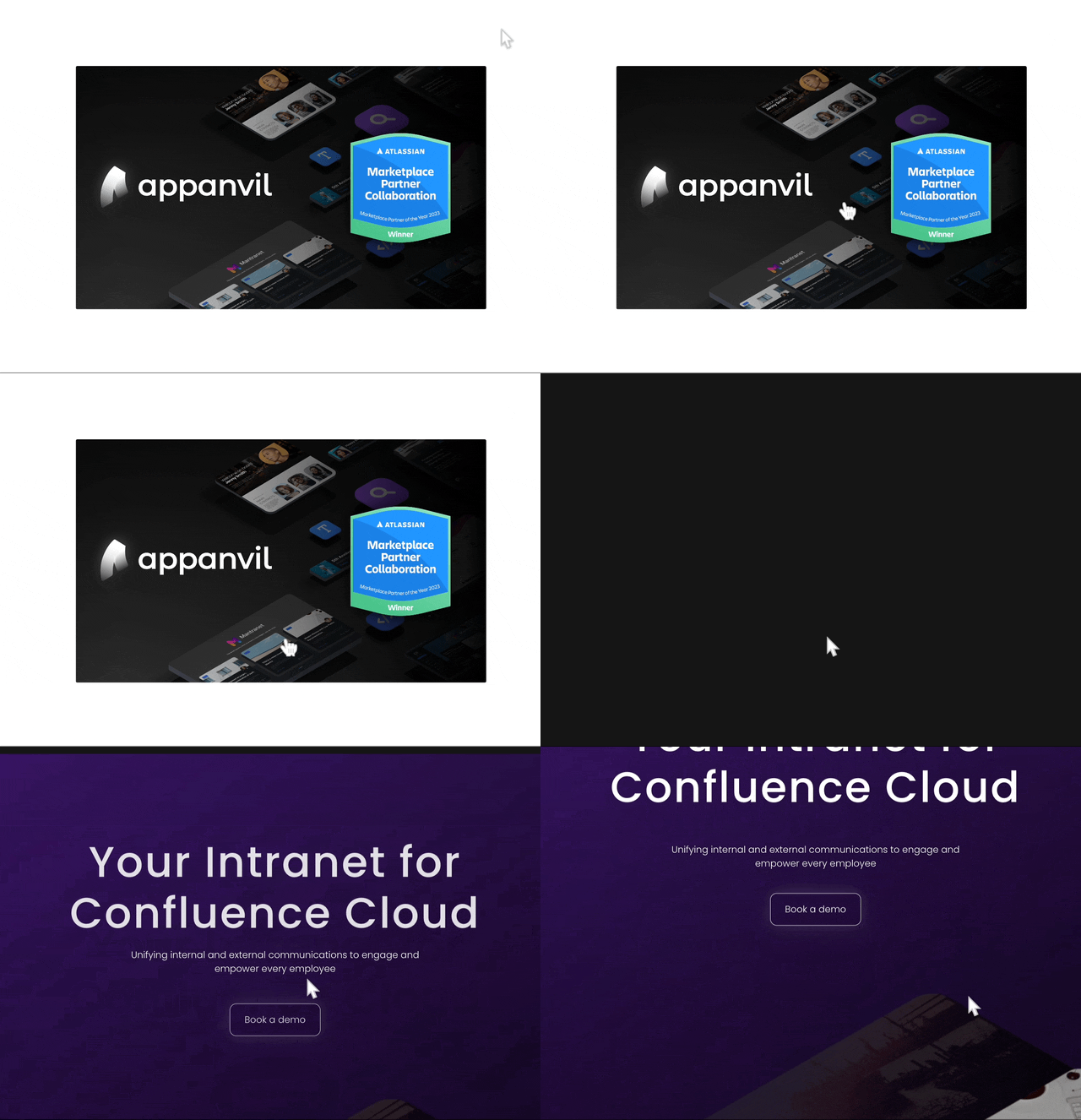
The Expand Macro can provide structure, but it doesn’t allow direct linking. Alternatively, you can insert images and add links to them for interactivity on your Confluence page. However, using this method means sacrificing fancy headings or editing images as cards.

And in the published mode, the picture is displayed like this:
4. Cards with Tables: The next option for creating cards with built-in Confluence macros is to use tables. Use the table formatting options to change the background color of each cell. This will visually distinguish your “cards” from the rest of the page content. The advantage here is that you can insert both images and text (which can be formatted). To create visually engaging content, add an image to the bottom cell of each table.
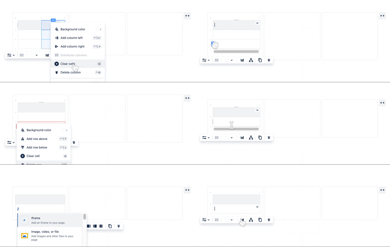
Then, insert your text into the top cell to provide necessary information or details. You can also include links within the text to direct users to relevant resources or additional content. Copy and paste your DIY cards to the other layout panels.
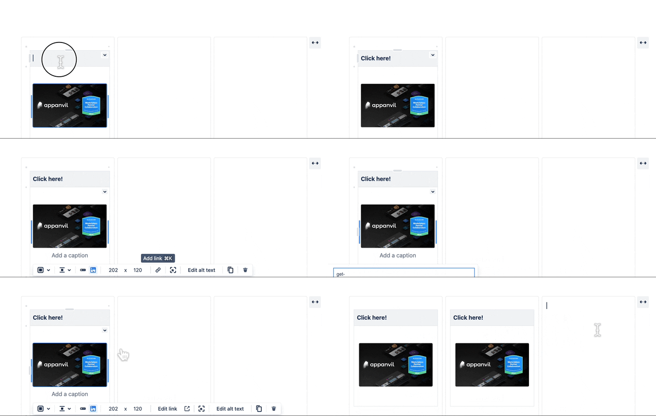
While the Layouts and Tables method offers a way to create a card-like layout, it has some limitations. First, you’re restricted to a grid layout with a maximum of three “cards” side-by-side. Additionally, these “cards” lack the animations or interactivity found in dedicated card macros. Finally, achieving a polished card design can be time-consuming, requiring manual adjustments for each “card.”
That’s why you might find the Aura Content Formatting macro suite helpful. It comes with a great interactive card macro.
With Aura Cards, you can effortlessly create up to six cards that are automatically organized in a clean and responsive layout. Each card is highly customizable, allowing you to tailor them to your specific needs.
Go to the Confluence page you wish to edit.
Click on the Edit button or press E.
In the page editor, click on the + button (Insert More Content) and select Other macros – you can also use the shortcut key “/” to insert the Aura Cards macro.
Now, you can choose between three card styles: classic, flip and hover.
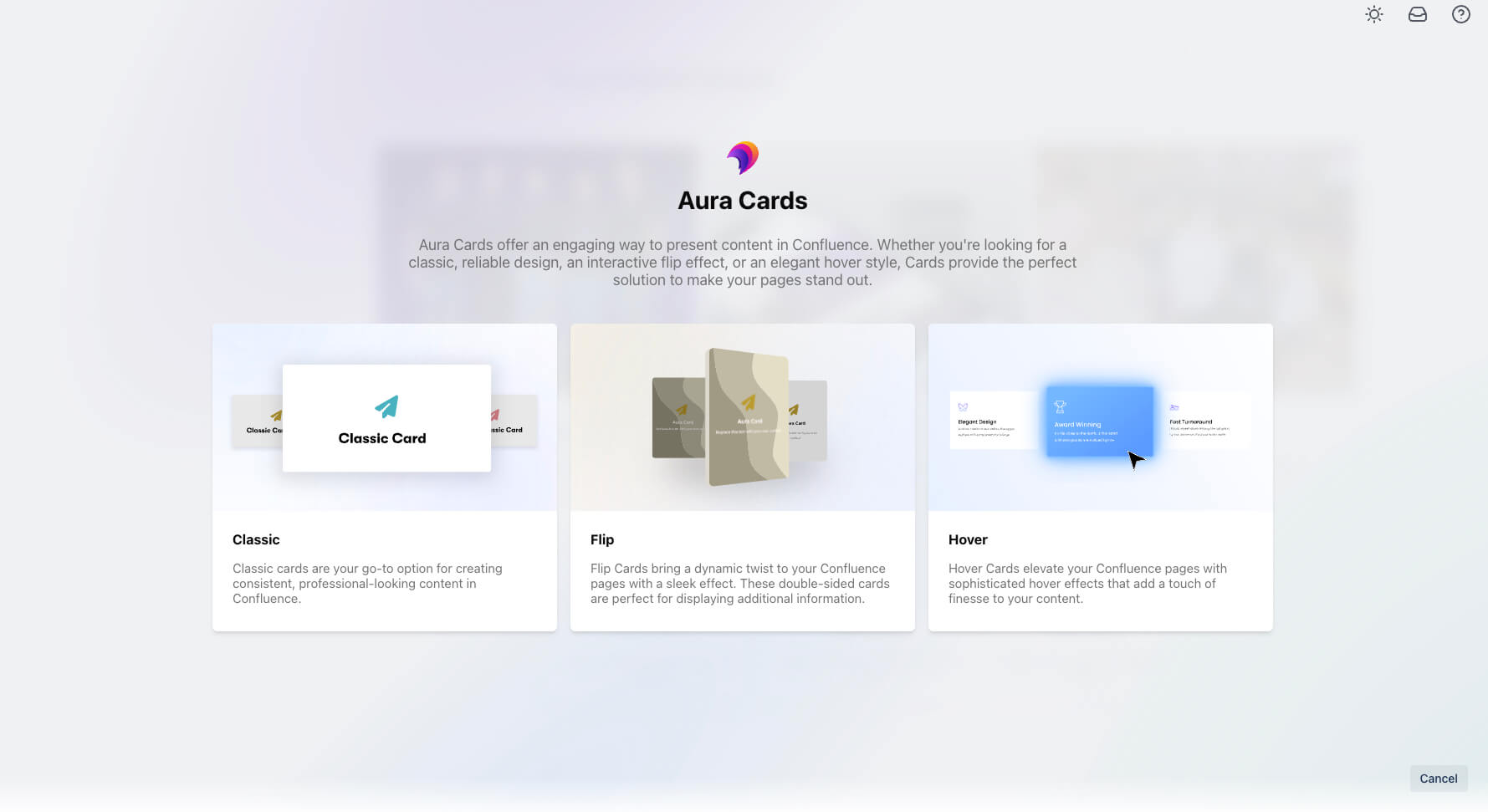
Each style can be previewed live to see how it enhances your Confluence page design.
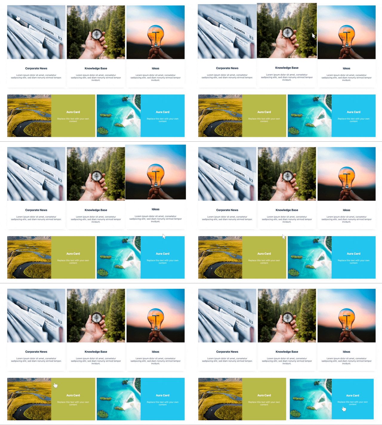
Here’s an overview of how the different styles will be displayed on your Confluence:
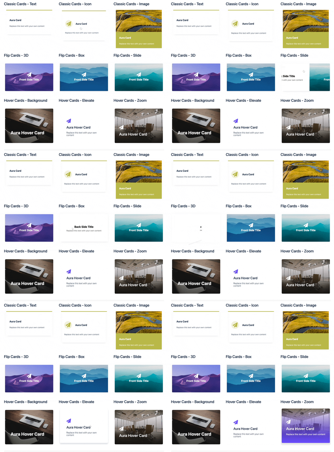

Choose how you want the text within your cards to be aligned – left, right, or centered. This ensures optimal readability based on your content.
Select the type of card you want to create:
Text Cards: Perfect for showcasing titles, detailed explanations, or key takeaways.
Image Cards: Combine captivating visuals with informative text, creating a more engaging user experience.
Icon Cards with Text: Incorporate a relevant icon to visually represent your card’s content, further enhancing user understanding.
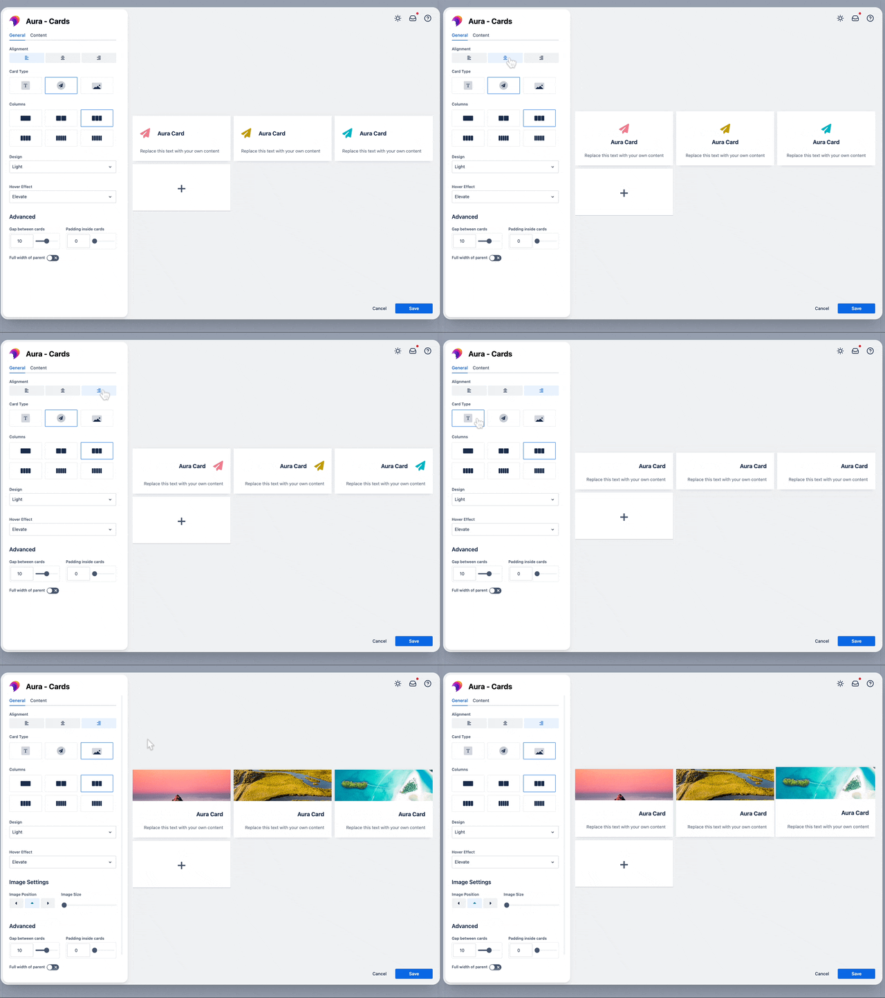
Pro Tip: Experiment with different Aura card types to see which best complements your content and resonates with your audience.
Decide how many columns you want to display your cards in. This helps you organize your content effectively based on the space available on your page.

Aura Cards offer a variety of pre-designed styles to select from. Select a design that aligns with your Confluence page’s overall theme and branding.
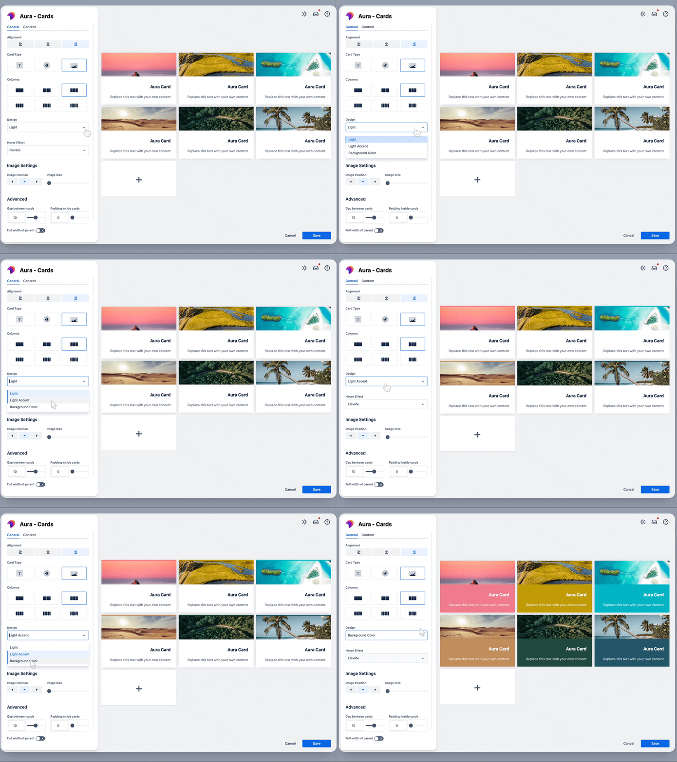
You can even choose the hover effect individually between elevate, shrink and no effect.
Adjust the image size and position to suit your individual needs.
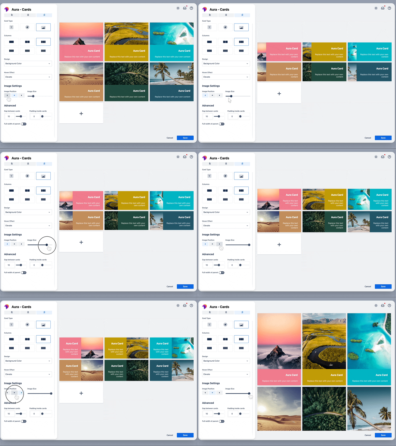
Also, feel free to adjust padding, gaps between Aura Cards and if they should have the width of their parent. Of course, you can also decide to use no image at all!
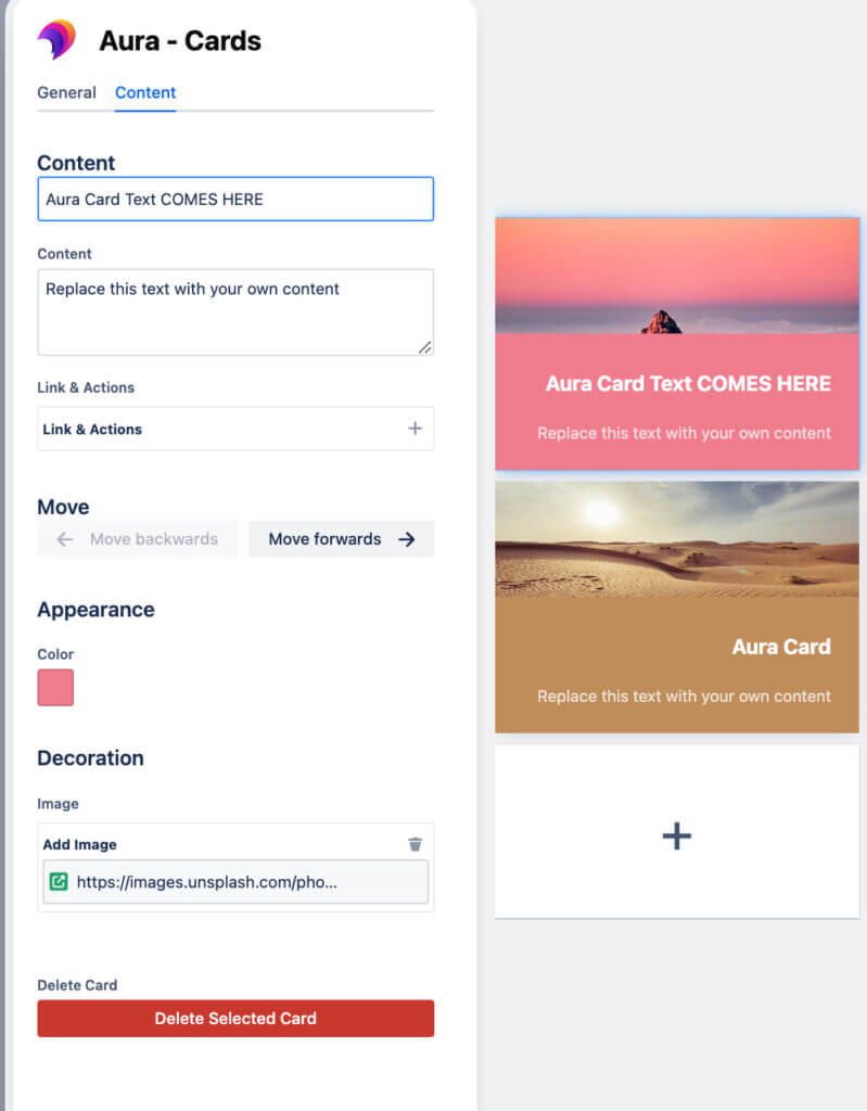
The “Content” tab empowers you to personalize each card within your set. Each card can be given an individual title to attract attention and increase engagement on your Confluence page. Content can be entered as wished, with color, images, and links – everything your design heart desires comes true with Auras Card Macro!
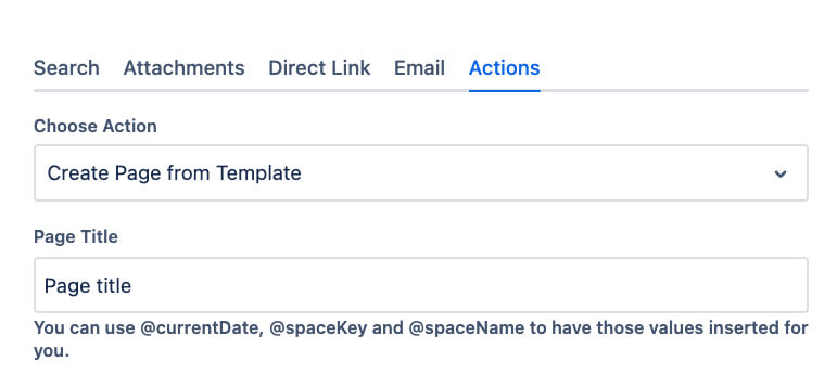
When it comes to links, you have several options: embedding content from Confluence, creating an attachment, providing a direct link, sending via email, or initiating an action.
The live preview window plays a crucial role in the configuration process. As you make changes in the “General” and “Content” tabs, the live preview dynamically updates. This allows you to see how your Aura cards will look at your Confluence page in real-time, making it easy to experiment with different settings and ensure your cards are visually appealing and well-organized.
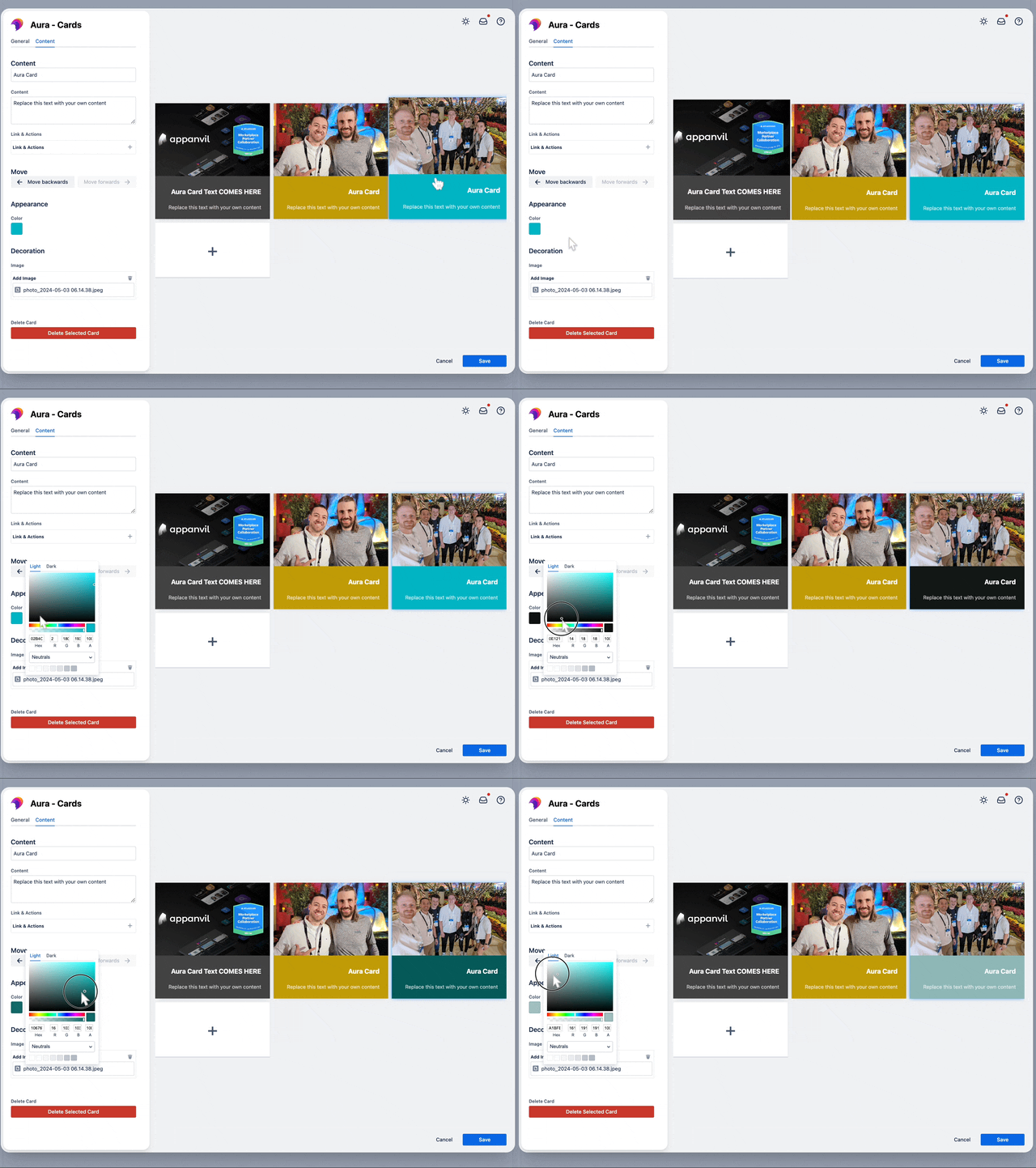
As with all Aura Macros, you can select all colors of the rainbow, enter a hex color code or pick from a color palette created by your Confluence admin.
Once you’ve customized your cards to your liking, simply click the “Save” button in the configuration dialog. Your beautiful and informative Aura Cards will be instantly visible on your Confluence page, transforming it from a text-heavy document into a visually engaging and user-friendly resource.
While Confluence’s built-in options (and workarounds) provide a starting point, they often fall short when it comes to unleashing your creativity for page design. Aura Content Formatting Macros empower anyone, regardless of coding experience, to break free from traditional layouts. Think about it: Build a navigation menu that’s actually fun to look at, turn your FAQ into a user-friendly masterpiece, or level up your project pages with stunning visuals.
Say goodbye to walls of text and hello to engaging, eye-catching content!
Ready to try Aura Cards for free? Head over to the Atlassian Marketplace and grab your 30-day trial. Experience the difference Aura Cards can make and see how easy it is to create content that keeps your team hooked!
Supercharge your Confluence

Struggling to keep everyone updated on the project status? We’ll show you how to easily

Tired of endlessly scrolling through Confluence to find what you need? We’ll show you how

The right intranet can make the difference if you thrive your simply survive. We’ll show

You are currently viewing a placeholder content from Wistia. To access the actual content, click the button below. Please note that doing so will share data with third-party providers.
More Information